FORT - logo design

inspiration for the “F” comes from the symbol of a willow tree
strong upper case letterforms
manipulated to appear stretched
tall like a vertical structure such as a turret on a castle
enclosed and protected like a fortress
works as a full word logotype or as a single letter logo symbol
recognizable and legible on a small or large scale
loosely inspired by the stacked letterforms for Helions brand identity designed by Pentagram

color palette & variations

product packaging
wax stamp, ink stamp on kraft paper sticker, paper packaging tape


full color vinyl sticker
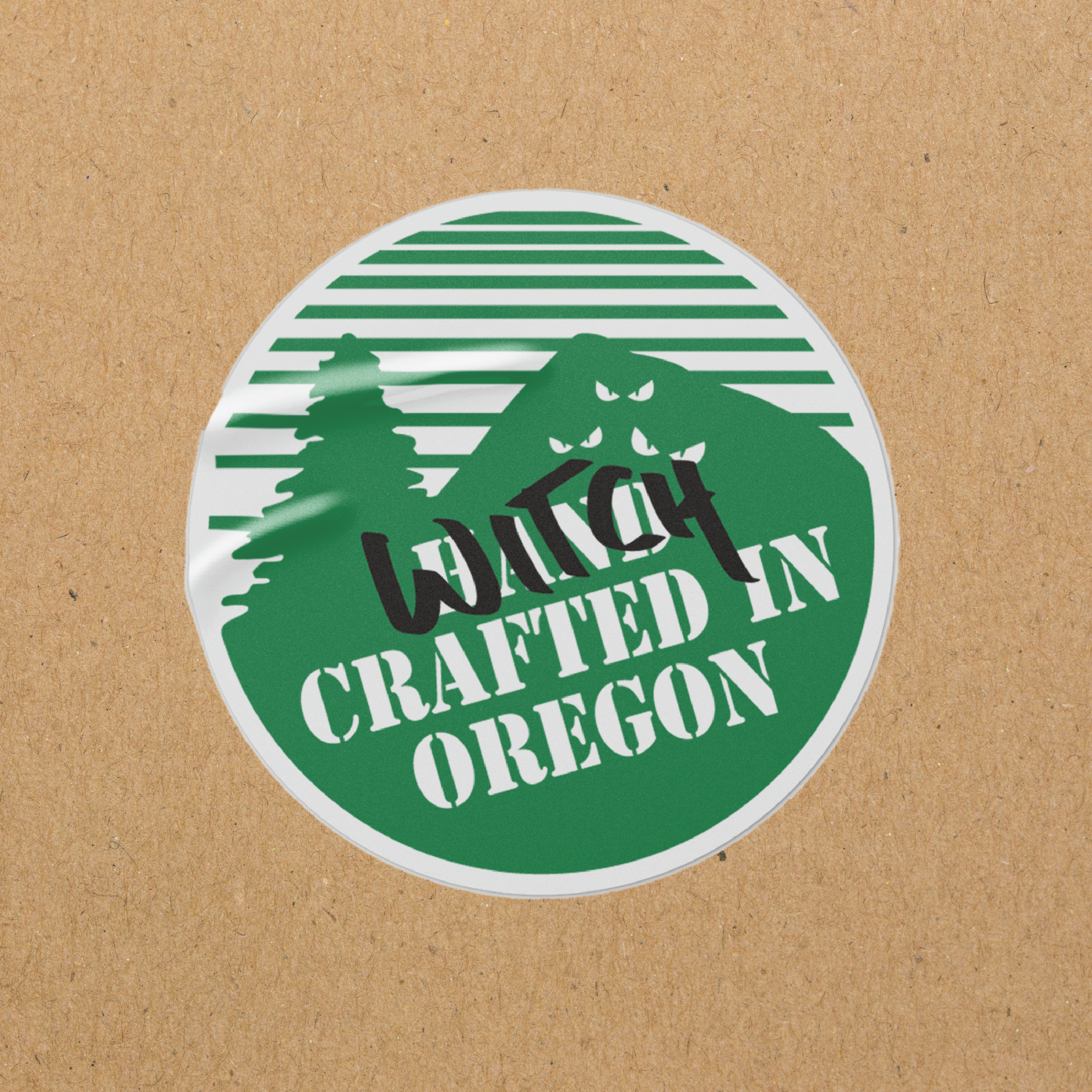
custom sticker design “witchcrafted in oregon” on kraft paper